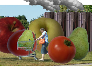
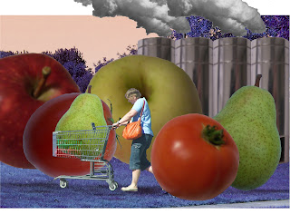
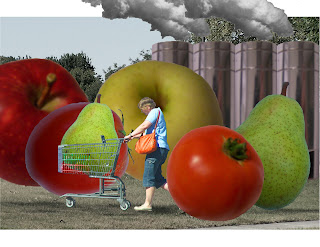
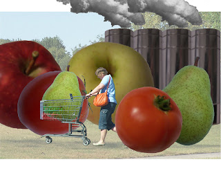
Wednesday, October 27, 2010

Week 10: Misfit Toy Packaging


Craft
The packaging was made for landscape format of tabloid paper. I started by making a large rectangle with the rectangle marquee tool and then filled it with a solid color with the paint bucket. Then I made guidelines around the box to make the sides. I made the sides of the box making rectangles again and then using different shades of the color from the front of the box for the sides. Then I used the transform-scale and transform-skew tool to adjust the size and angle of the sides to create three dimensionality and perspective. The front, top, and side were all in different layers. Then using the rectangle marquee tool, I made another rectangle in the front layer to make a window and then I deleted the selected area. Then I made another rectanngle behind all the layers with a solid color to serve as the back of the box. Then I compied and pasted the elements of the playset from the original photoshop file and resized all the elements together to scale so they would fit in the box. I rearranged them to fit in individual compartments. I made the compartments with the rectangle marquee tool and, like the box, made tops and sides for the compartment dividers with more rectangles. I merged the box and compartment dividers together. Then I used the blending options to add a drop shadow for the inside of the box. Then I added a drop shadow for all the objects in the box. I used the eliptical marquee tool and lasso tool to create the feature panels over the window of the box. With the gradient tool, I made the plastic window glare with 100% white opacity on the ends and 0% opacity in the center, then dragged the gradient diagonally across the window. I added the text and on the largest text I used the bevel and emboss blending option.
Concept
The concept is a box with different compartments and the meat chart in the background used as a backdrop.
Composition
I wanted the items to be arranged in a matter of importance. The slaugthering machine is in the center surrounded by the animals, meat, and bottles.

Wednesday, October 20, 2010

Week 9: Misfit Toy Draft


Craft
Starting with a blank 11 X 17 sheet in landscape format, I started by cutting out the cow with the magic wand tool and then touching it up with the block eraser. All images were dragged and dropped into Photoshop, then copied and pasted into the compostion. The pig was cut out the same way with the magic wand and block eraser tools. Both had simple backgrounds and sharp resolution. Next was the treadmill. It had a white background and was easy to cut out with the magic wand, including the background in the netting. The cuts of meat were cut out from a black background and resized with the transform-scale tool. The chart was placed underneath all layers, skewed to look tilted, and the white background was pianted silver with the bucket tool. The razor blade was cut out with the magic wand and placed under the treadmill layer. I temporarily placed it on top to use the lasso tool and selected the treadmill layer to cut out the arm so when the razor blade was placed underneath it looked in between the arms of the teadmill. The bottle was cut out with the magic wand and block eraser, placed in the background. The hue was changed to red from the original blue cap. A layer was added on top and painted with the brush tool with red with opacity set to around 50%. Then the two layers were merged and then that new layer was copied. The cow was copied, flipped horizontally, and the value was changed to white. Then with the paint bucket, it was changed to a yellowish beige, then on the same layer, painted with blotches of red with opacity at 70%.

Online Photo Reference List
http://www.annastoydepot.com/animals/cow-family
http://www.annastoydepot.com/animals/pig-and-piglet
http://www.dogtreadmill.ie/2008/10/23/dog-jogger-treadmill/
http://www.askthemeatman.com/hind_qt_cuts.htm
http://www.howto-cooksteak.com/

Concept
The gruesome reality of where our meat comes from is deemed socially unexceptable for young children to be aware of.
Composition
The composition was intended to look like an advertisement in a catalog or end-of-commericial still shot of a laid-out playset. I put the slaughter machine in the center with farm animals on the left and cuts of meat on the right so the eyes read it like a book. Here are some online images used for inspiration:
http://www.sourcingmap.com/gas-truck-tanker-model-fruit-bus-buddys-truck-toy-sets-p-23972.html
http://2ols.com/item_13150_462762954-Kids-Construction-Set-Toys-Construction-Set-span-style-color990000A-Savings-of-18-htm

Week 8: Misfit Toy Photographs


Craft
For these photos, I tried to get the highest resolution possible. I took a number of shots against a simple background so they would be easy to cut out in Photoshop.
Concept
The concept for my misfit toy is a slaughterhouse playset and the miter saw blade is part of a conveyor belt slaughtering machine. The water bottles will be used for fake blood included with the set.
Composition
The photo is a profile of the miter saw blade becasue it captures the sharpness and dangerousness of the blade and it is attached to the conveyor belt which is also a side view. The photo of the bottle will be rotated eventually to be vertical and be placed in the playset display.

Week 7: Collage Final


Craft
I used the same background as the original, but resized it using the transform-scale tool to fit the full size of the letter paper. All of the fruits and vegetables were copied and pasted in and then cut out using the magic wand and block eraser. Then they were all resized using the transform-scale tool. The smoke and the smokestacks were all resized using transform-scale and the saturation was reduced using ajustments-hue/saturation. The saturation of the smaller pear in the shoppers cart was increased. The shopper and the cart were cut out with the block eraser because of the busy background and fine detail of the low resoultion photo.
Concept
Oversized fruits and vegetables and the factory represent the point when manufactered produce becomes rediculous.
Composition
The compostion has the viewer see the giant fruit first followed by the shopper then the factory in the back. The actual background I think is somewhat irrelivant but grounds the image somewhat. As for the lower value and saturation for the background, they help show off the foreground and make the fruit and factory stand out a little more.

Wednesday, September 29, 2010

Week 6: Hue, Saturation, and Value


Craft
First of all, I removed the text from the composition, and also added photos of smoke for the factory's smokestacks. As for the hue, saturation, and value, I mainly used those for the background and only slightly enhanced the saturation of the fruits and shopper in the foreground while lightening the value of the smokestacks. For the background, I darkened the hue of the background to make the colors of the fruit pop. The saturation was also lowered for the background next to again make the fruit stand out. The value was lightening in the third to make the foreground show.
Concept
I removed the text because I thought that it was too distracting. I decided to make it the title instead. I put in more realistic smoke to make the factory more realistic and recognizable since the text was now deleted. The hue, saturation, and value were changed mainly in the background because I thought that the background did not serve much purpose for the message and I did not want to change the fruit and factory too much because I wanted them as recognizable as possible.
Composition
The composition makes the viewer notice the shopper and fruit first as intended, then the factory. The saturation and value changes of the background achieve this by causing the foreground to show better. The reviews from peers said the same thing basically. Besides some photoshop clean up needed, the resolution of the photos were the biggest hindrance but most got the factory concept and thought the value lightening in the background was the best at doing that.

Week 5: Collage Final Draft


Craft
For this version of my collage, I added more fruit and the shopper with the cart which proved difficult because of the low resolution photos. I used the same backdrop from the rough draft and but I add smokestacks which were one that was copied to create a row that symbolize a factory. I added smoke in photoshop to make them more recognizable as as smokestacks. Lastly, I did add the text "Fresh Produce" to draw the viewers eye to the factory in the back.
Concept
The concept that I chose to go with is the point at which food production in the U. S. becomes ridiculous. I try to achieve this by creating overgrown fruit in the foreground, overbearing the shopper who kind of struggles to push her cart. The factory in the background symbolizes the processing and how it is more chemical than natural growing.
Composition
The composition consists of the shopper in the foreground surrounded by overgrown fruits and vegetables. This is to make the distinction that this is a market or farm stand but the overgrown produce is the ironic part. The factory in the background then answers this irony. That is the general direction that the viewer's eyes should be lead.

Wednesday, September 15, 2010

Week 4: Collage Rough Draft


Craft
Using Photoshop, we were to combine at least one person, one place, and one object from the photos that we took previously to form a collage. As for the place, I chose the park because I thought it was the best shot and used it for the background or setting. However, stretching the image to fit the paper distorted its resolution too much so I left it alone which effected its small size upon printing. For the person, I chose the crossing guard. The quality of the photo was one of the worst but I thought it was one of the easiest to cut out. I was still in a state of practice mode. As for the object, I chose the pear. I chose it because it was the best one that I cut out and we needed at least one unexpected or ironic aspect in our composition.
Compostion
The compostion itself is small due to the lack of resizing the background image. The crossing guard was rescaled to fit the scale of the foreground as well as the pear which was rescaled and left large in comparison with the crossing guard and park setting. The pear was duplicated and rescaled so there were three overall and the each were overlapped to make some depth. The pear in the front was brightened and the pear in the back was darkened to enhance the illusion. However, the sunlight in the background photo is different from the sunlight in brightness and direction from the crossing guard and the pear.
Concept
Mostly I was just practicing when initially making the collage, and lost focus on thinking of a concept especially with the photos that I had to work with. What I plan on doing is changing the background entirely to a different image as well as the crossing guard. I have a picture of a shopper with a cart instead and I thought that a concept could either be about concerns of genetically altered food or the wasted surplus of produce in America. The concept as it is now does not really have any meaning except for a bit of irony in that there are giant pears with a crossing guard.