

Craft
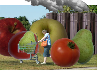
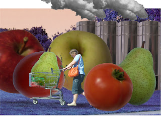
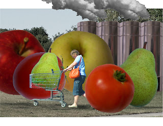
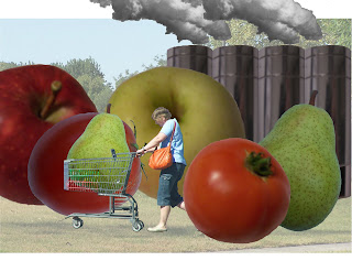
First of all, I removed the text from the composition, and also added photos of smoke for the factory's smokestacks. As for the hue, saturation, and value, I mainly used those for the background and only slightly enhanced the saturation of the fruits and shopper in the foreground while lightening the value of the smokestacks. For the background, I darkened the hue of the background to make the colors of the fruit pop. The saturation was also lowered for the background next to again make the fruit stand out. The value was lightening in the third to make the foreground show.
Concept
I removed the text because I thought that it was too distracting. I decided to make it the title instead. I put in more realistic smoke to make the factory more realistic and recognizable since the text was now deleted. The hue, saturation, and value were changed mainly in the background because I thought that the background did not serve much purpose for the message and I did not want to change the fruit and factory too much because I wanted them as recognizable as possible.
Composition
The composition makes the viewer notice the shopper and fruit first as intended, then the factory. The saturation and value changes of the background achieve this by causing the foreground to show better. The reviews from peers said the same thing basically. Besides some photoshop clean up needed, the resolution of the photos were the biggest hindrance but most got the factory concept and thought the value lightening in the background was the best at doing that.
No comments:
Post a Comment