Wednesday, December 8, 2010

Week Finals


Craft
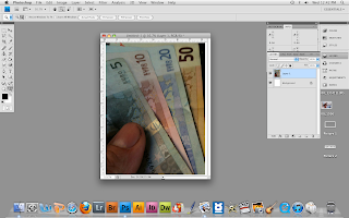
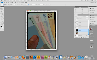
First of all, I stated by creating layers that I was going to use for painting color. I used the eye dropper tool to pick the colors for a certain part of the photo and used my premade brushes to paint it. I started with the black background and used my sponge brush to cover the entire layer, covering all the pixels of the photo, then I used my various brush brushes to paint the bills in the back to the front then the thumb last. I picked out the most general colors.
Concept
The concept is really just a person holding money, but it's more about the brushwork, as it is intended to look painted by paintbrush. Also, a lot of the detail on the bills was generalized to just blotches of color. Eventhough the fine detail is gone, the viewer can still see that it is money.
Composition
In the original photo, the angle of all the bills create lines of force that guide the eye to them. In the painted version, the blotchy colors break up that force and the contrast in color between the thumb and the bills attract the eye to the thumb first.

Wednesday, December 1, 2010

Week 15: Photo Paint


Craft
I started by setting the photo as a separate layer on the bottom. After that I created a subsequent layers on top of the photo that includes separate colors of paint at different values, lifght to dark, for the background and then for the dog. Using only the eye dropper and paintbrush tools, I started by making a simple background by picking out just genearl shapes and colors that would not distract from the dog in the foreground. I omitted such things like what was outside of the windows and an other random objects in the room that did not have anything to do with the dog. I started by picking out the lightest colors of the dog and painted over it in a separate layer and then gradually picked the darker colors and painted the finer details in separtate layers.
Concept
The concept is simple, the picture is supposed to focus on the dog.
Composition
Since the random obects are omitted and the background is simplified, the dog pops especially with the contrasting colors over the background.

Week 14: Paintbrush Collage


Craft
The collage was made with only paintbrushes. First the background was painted black, then the circle brush was used as a stamper to make an arrangement of circles of varying color, size, opacity, and hardness. A simple color scheme was choosen. The white doves and signiture were drawn in grayscale on a separate document and made into preset brushes, then used as a stamper.
Concept
The concept is magician's doves flying away from the stage, represented by the bright, sparkling lights made by the circles.
Composition
The viewer's eyes are drawn to the doves first, then to the stage lights.

Week 13: Texture Collage


Craft
All natural and manufactured textures were imported with a scanner at 300ppi. In the first collage, the leaves were cut out with the eraser and magic wand tools. Their hue was changed to a brownish, yellowish orange. The textures in the background were cut out with the lasso tool and the inverted selection was deleted. In the second collage, the leaves' hue was changed to green. They were arranged to ressemble a shrub or crop and were merged into one image layer, then repeated, rotated, and rescaled. The rag textures had their hues changed and they were rearranged and skewed. The same rag texture was used used to create the barn with hue and saturation changes. The mountains were made with the sandpaper texture which was cut out in various shapes and layered with lessening opacity against a blue background.
Concept
The first collage's concept is to represent collors and textures of autumn. The second is a farm landscape.
Composition
The first collage draws the viewer to the leaves on top, then the brighter textures, then the darker textures. The second collage draws the viewer's eye along the row of foliage to the barn in the background.

Week 12: Photo Recolor


Craft
I took each of these photos and set the saturation to zero and set each of the layers to multiply to make the whites transparent. The center photo was lowered in contrast to make the ocean pop more once the colors were introduced. For the background, I used a basic blue, then I used a less saturated blue, and a tinted blue and painted picked out items.
Concept
The concept was to keep the beach scenes theme constant and to pick out smaller items to make them stand out.
Composition
In the first photo, the birds are painted with the dull blue to stand out amoung the blue background and the water is painted the brighter blue to draw the viewer to the water instead of the beach. In the center photo, the water is again brightened to stand out in the background. In the last photo, the lighthouses are brightened to stand out from the water which stands out with the duller blue against the sky and beach.

Week 11: Misfit Toy Final


Craft
Not much changed from the previous packaging except for teh font of the text on the box and the shape of some of the package's edges around the display window. I used the photo of the miter saw blade and cut out a portion of the blade and placed it in the corners of the cover of the box. I raised the value of the cropped blades to white and then used the eye dropper tool to match the color of the box and painted the cropped layers to the box layer so the orp shadows would transfer. I used cracked text for "Slaughterhouse Playset," made it bold and added a stroke. I used arial for the rest. I rotated the text in the upper left. For the playset layout, I used the same text, except I arched the "Slaughterhouse Playset" text over the playset layout.
Concept
The concept is to sell the danger aspect of the playset.
Composition
The red text taht stands out on the gray box and also the razor blade edges on the box stress the point.

Saturday, October 30, 2010

Special Edition Blog: Art Institute Trip

This is a special edition blog regarding the Art Institute visit on October 14.
We had to choose 3 works that we thought were inspiring and write about their craft, concept, and composion.

Here's the picture of me.

Here's the picture of you.


Mountain Road
Joos de Momper II
1600-1625
Craft
This painting is oil on panel and utilizes brushstroke to bring the foliage into a realist fashion. Although the people and objects in the foreground have dark, noticable outlines and are painted with bright, sharp colors, the trees and landscape blend together with the evident brushstrokes to appear less illustrated and more like actual real life landscape scenery. The further in the background you look the more blending of color and contrast come into play.
Concept
The concept of this painting is striving for realism. As it is a baroque piece, close attention to nature is needed to achieve an accurate and realistic appearence for the landscape and foliage. The painting captures the vastness of nature and stives to accurately dipict real life perspective for the viewer.
Composition
The foreground uses sharper edges, mainly for the people and objects, but uses darker tones and the more defined edges to separate the foreground from the background which is the overlook from the valley. The large tree in the center is heavily illuminated on the backside and the trunk is darkend to show the illusion of natural light. Plus the tree is foreshortened somewhat and leans back into the painting and into the background. The birds flying in the air even like they are part of the middle ground and further give the illusion of space.
Still Life with a Basket of Fruit and a Bunch of Asparagus
Louise Moillon
1630
Craft
This painting is oil on panel and pays close attention to proportion, detail, and realism. Brushstroke is barely evident because this is not a landscape where differnet elements blend together but a still life. The brushstroke is so fine that the elements are separate from one another. There are very gradual changes in color were need be and high contrast with the differenet colors of fruits and black background.
Concept
Again, this painting is striving for realism, but with a still life rather than a vast landscape. The fruit and the leaves are trying to achieve not just looking like fruit and leaves, but showing the qualities and feeling of fruit and leaves. The fruits look ripe and juicy, the asparagus looks like it has been freshly cut, and the leaves look ligth and fragile.
Composition
The composition uses shallow space and dramatic lighting to illuminate every detail of the subject. There is also special attention to how the different shapes of the fruits and leaves react with the lighting.

Quadrangles in Two Planes
Irene Rice Pereira
1945
Craft
There are two levels in this painting that consist of a lower layer of oil on panel and a top layer of oil on glass. The bottem layer uses vibrant colors while the top layer uses mainly black for a high contrast.
Concept
The concept is to create a three dimensional painting with two dimensional geometic shapes that require two layers.
Composition
The vivid colors on the bottom layer contrast with the black on the top layer. This creaets depth and dimension. The colors on the bottom layer are lighter than the black and seem in a way atmospheric.